Module 8. Statistical quality control
Lesson 27
CONTROL CHARTS FOR VARIABLES
27.1 Introduction
In the previous lesson various terms used in the context of ‘Statistical Quality Control’ were described. As stated earlier the process control is carried out to control the manufacturing process so that the proportion of defective items is not excessively large. This is mainly achieved through the application of control charts which were developed by Dr. W. A. Shewart of Bell Telephone Laboratories, USA. These control charts provide a powerful tool of discovering and correcting the assignable causes of variation outside the “stable pattern “of chance causes, thus enabling us to stabilize and control our processes at desired performances and thus bring the process under statistical control. In industry, one can face with two kinds of problems: i) to check whether the process is conforming to standards laid down and ii) to improve the level of standards and reduce variability consistent with cost considerations. In this lesson we discuss various control charts for variables that are used in the industry.
27.2 Control Chart
To maintain the quality of the product manufactured, quality control charts are prepared to maintain the uniformity in the quality of the product manufactured. The power of the Shewhart technique of control chart lies in its ability to separate out the assignable causes of variability.
27.2.1 Merits of control chart
1. This makes possible the diagnosis and correction of many production troubles and often brings substantial improvements in product quality and reduction of spoilage and rework.
2. Moreover, by identifying certain of the quality variations as inevitable chance variations, the control chart tells when to leave to process alone and thus prevents unnecessary frequent adjustments that tend to increase the variability of the process rather than to decrease it.
3. By control charts, it is possible to detect assignable causes of variation and we can remove the factors responsible to bring back the production process within the stable system of variability.
4. It also permits better decisions on engineering tolerances and better comparisons between alternative designs and between alternative production methods.
5. Through improvement of conventional acceptance procedure it often provides better quality assurance at lower inspection cost.
6. It helps us in taking decision on matters relating to the quality. It provides us the basic variability of the quality characteristics. It estimates the capability of production process by estimating the inherent variation in the quality of the product manufactured.
7. It helps us in consistency of performance. The quality control charts tell us when to leave the production process alone and undisturbed and when to take remedial measures to bring back the quality under control.
8. It helps us to detect assignable causes of variation in the quality of product. This detection and correction of assignable causes of variation in quality of the product helps us in 3 ways viz.,
(a) It ensures reliable quality level.
(b) It reduces the spoilage and rework.
(c) It builds us consumer confidence in the quality of the product which cannot be measured by any terms but which is of utmost importance.
Indirect benefits of SQC are:
(i) Introduction or improvement of the inspection department helps us to install an inspection department.
(j) It helps us to evaluate periodically the performance of the production process or department in terms of quality.
27.3 Objectives of Control Chart
a) To secure information to be used in establishing or changing specification or in determining whether a given process meet specifications.
b) To secure information to be used in establishing or changing production procedures. Such changes can be either elimination of assignable causes of variation or fundamental changes in production methods that may be called for whenever the production control charts makes it clear that specifications cannot be met with present methods.
c) To secure information to be used in establishing or changing inspection procedures or acceptance procedures or both.
d) To provide a basis for current decisions during production as to when to hunt for causes of variation and take action intended to correct them, and when to leave a process alone.
e) To provide a basis for current decisions on acceptance or rejection of the manufactured or purchased product.
27.4 Rational Subgroups
The Central idea in Shewhart’s control chart technique is the division of observations into what are called rational subgroups. These are to be taken in such a way that variation within a subgroup may be attributed entirely to chance causes while systematic variation ; if at all exists, can occur only from one subgroup to another. That is subgroups should be selected in such a way that they are homogeneous as far as possible and that gives the maximum opportunity for variation from one subgroup to another so that different subgroups may indicate the presence of systematic variation.
The most obvious basis for the selection of subgroups is the order of production. As applied to control charts on production, this means that each subgroup should consist of the product of a machine or a homogeneous group of machines for a short period of time, so that there may not be any remarkable change in the cause system within that period. Therefore, if primary purpose of keeping the charts is to detect shifts in the process average, one subgroup should consist of items produced as nearly as possible at one time; The next subgroup should consist of items all produced at a single later time and so forth. The use of such subgroups would tend to reveal assignable causes of variation that come and go. However, there may be assignable causes that are not revealed merely by taking subgroups in the order of production e.g., two or more machines in a factory may have different patterns of variation. In this case it may be necessary to have different subgroups for different machines or for different operators or for different shifts. The problem of process control then boils down to the use of methods that would enable us to judge whether the distributions of the given quality characteristic for the different subgroups are identical or not. In case the distributions are identical, the process may be supposed to be in control. Otherwise, the process will be considered to be out of control and one has to look for the source of trouble.
Shewhart suggested four
as the ideal subgroup size. In the industrial use of the control chart,
five seems to be the most common size. Because the essential idea of the
control chart is to select subgroups in a way that gives minimum opportunity
for variation within a group, it is desirable that subgroups be as small as
possible. On the other hand, a size of four is better than three or two
on statistical grounds because the distribution of ![]() is nearly normal for subgroups of four or more
even though the samples are taken from a non-normal universe; this fact is
helpful in the interpretation of control chart limit. A reason for the
use of five as the subgroup size is ease in computation of the average, which
can be obtained by multiplying the sum by two and moving the decimal point one
place to the left. Subgroups of two or three may often be used to good
advantage, particularly where the cost of measurements is so high as to the use
of larger subgroups. Larger subgroups such as 10 or 20 are sometimes
advantageous where it is desired to make the control chart sensitive to small
variations in the process average. The larger the subgroup size, the
narrower the control limits on charts for
is nearly normal for subgroups of four or more
even though the samples are taken from a non-normal universe; this fact is
helpful in the interpretation of control chart limit. A reason for the
use of five as the subgroup size is ease in computation of the average, which
can be obtained by multiplying the sum by two and moving the decimal point one
place to the left. Subgroups of two or three may often be used to good
advantage, particularly where the cost of measurements is so high as to the use
of larger subgroups. Larger subgroups such as 10 or 20 are sometimes
advantageous where it is desired to make the control chart sensitive to small
variations in the process average. The larger the subgroup size, the
narrower the control limits on charts for ![]() and the easier it is to detect small
variations. Generally speaking, the larger the subgroup size, the more
desirable it is to use standard deviation rather than range as a measure of
subgroup dispersion. A practical working rule in this case is to use
and the easier it is to detect small
variations. Generally speaking, the larger the subgroup size, the more
desirable it is to use standard deviation rather than range as a measure of
subgroup dispersion. A practical working rule in this case is to use ![]() and s
charts rather than
and s
charts rather than ![]() and R-charts whenever the subgroup size is
greater than 15.
and R-charts whenever the subgroup size is
greater than 15.
27.5 Techniques of Control Chart
Shewhart’s control chart technique is a particular diagrammatic method of making this comparison and thus deciding whether the process is or is not affected by systematic variation. Let us first focus our attention on some parameter of the distribution say θ. Let T be the corresponding statistic. If the process is in control then θ must be same from subgroup to subgroup and consequently the fluctuations in the values of T from sample to sample should be due to random variation alone. Supposing in such a case
E (T) = mT and V (T) = σT2
One may take any value of T lying outside the limits (mT -3sT ) and (mT +3sT ) as an indication of the presence of systematic variation reason being
![]()
Even when T is non-normal, we have from
Chebyshev’s inequality
![]()
The
Central Limit Theorem also states that whatever be the distribution of parent
population, when we draw samples from the population the distribution of sample
mean ![]() will
follow Normal distribution. Thus if the observed Ti lies between the
limits (mT
-3sT
)
and (mT
+3sT
),
it is taken to be a fairly good indication of non-existence of assignable
causes of variation at the same time when ith sample was
taken. If the observed Ti wanders outside the limits, one suspects
the existence of assignable causes of variation and the process is supposed to
be out of control. The obvious action is then to stop the process and to
hunt for and remove the assignable causes. The testing is however, done
by means of a graph where sample number is plotted on X-axis and the statistic
T are plotted on Y-axis. The lower control limit (LCL) mT
-3sT
and
the upper control limit (UCL) mT +3sT
are
shown on the chart by means of horizontal lines. The line corresponding
to the mean value mT is
called the Central line. The process is said to be out of control if any
point falls below the LCL or above the UCL (see fig. 27.1). Even if all
the points may be inside the control limits, indications of trouble or presence
of assignable causes of variation in the process are sometimes evidenced from
unusual patterns or arrangement of points e.g.,
will
follow Normal distribution. Thus if the observed Ti lies between the
limits (mT
-3sT
)
and (mT
+3sT
),
it is taken to be a fairly good indication of non-existence of assignable
causes of variation at the same time when ith sample was
taken. If the observed Ti wanders outside the limits, one suspects
the existence of assignable causes of variation and the process is supposed to
be out of control. The obvious action is then to stop the process and to
hunt for and remove the assignable causes. The testing is however, done
by means of a graph where sample number is plotted on X-axis and the statistic
T are plotted on Y-axis. The lower control limit (LCL) mT
-3sT
and
the upper control limit (UCL) mT +3sT
are
shown on the chart by means of horizontal lines. The line corresponding
to the mean value mT is
called the Central line. The process is said to be out of control if any
point falls below the LCL or above the UCL (see fig. 27.1). Even if all
the points may be inside the control limits, indications of trouble or presence
of assignable causes of variation in the process are sometimes evidenced from
unusual patterns or arrangement of points e.g.,
(a) A series of points all falling close to one of the control limits.
(b) A long series predominantly on one side of the central line.
(c) A series of points exhibiting a trend.
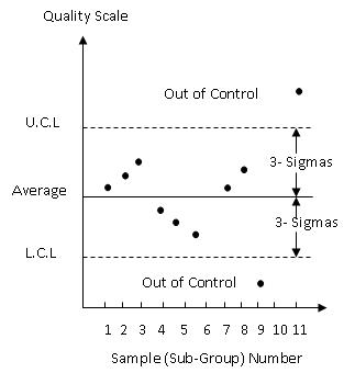
Fig. 27.1 Outline of a control chart
27.6 Types of Control Chart
Control charts may be of two types as stated below:
1. Control
chart with respect to given standards: Here our purpose is to discover whether
the observed values of ![]() ,
s, p etc. for samples of n items differ from standard values
,
s, p etc. for samples of n items differ from standard values ![]() ,σ,p
etc. by an amount greater than what should be attributed to chance. The
standard values may be either established by authority as some desired values
designated by specification or some economic standard levels provided by
experience. These charts are used to maintain quality uniformly at the
desired level.
,σ,p
etc. by an amount greater than what should be attributed to chance. The
standard values may be either established by authority as some desired values
designated by specification or some economic standard levels provided by
experience. These charts are used to maintain quality uniformly at the
desired level.
2. Control
chart with no standards given: Here we want to discover whether the observed
values of ![]() ,σ,p
etc. for samples of size n vary amongst themselves by amount greater than what
should be attributed to chance. These charts are used to detect lack of
constancy of the cause system. So far as the size of the samples for different
subgroups are concerned, small samples at shorter intervals are always
preferable to large samples at longer intervals.
,σ,p
etc. for samples of size n vary amongst themselves by amount greater than what
should be attributed to chance. These charts are used to detect lack of
constancy of the cause system. So far as the size of the samples for different
subgroups are concerned, small samples at shorter intervals are always
preferable to large samples at longer intervals.
27.7 Control Charts for Mean, Standard Deviation and
Range
Suppose
we are dealing with a quality characteristic like length, diameter or breaking
strength, Moisture content in khoa, fat content in Ice-cream, filling of milk
in bottles/pouches, filling of Ghee & condensed milk in tins, moisture in
butter etc. For manufactured articles subject solely to random variation
such a variable may be supposed to be normally distributed. So the different
distributions of x for the different subgroups are then all supposed to be of the
normal type, the ith subgroup giving a distribution with mean mi
and
variance σi2.
To examine whether the process is in control, we need to see whether the m’s
and the s’s are the same. The four types of situations
encountered are given below:-
(a) The process is in control.
(b) The mean is out of control but not the standard deviation (s.d)
(c) The s.d. is out of control but not the mean.
(d) Both mean and s.d. are out of control.
The appropriate statistics corresponding
to m
and s
are ![]() and s. Hence the whole judgment regarding
control or lack of it is based on control charts for
and s. Hence the whole judgment regarding
control or lack of it is based on control charts for ![]() and s. It is to be remembered, however
that the range R inspite of its theoretical inferiority to s, is simpler and
easier to compute. Hence in quality control, the range is often preferred
to s.d. and one uses
and s. It is to be remembered, however
that the range R inspite of its theoretical inferiority to s, is simpler and
easier to compute. Hence in quality control, the range is often preferred
to s.d. and one uses ![]() and R charts instead of
and R charts instead of ![]() and s chart.
and s chart.
27.7.1 Control charts for mean
27.7.1.1 Standards given
For samples of size n per subgroup, we
have E ![]() = m and
= m and ![]()
Assuming that n observations in each
subgroup are mutually independent .Hence if, the values, for m
and s′,
are specified as ![]() and σ’,
the control chart for
and σ’,
the control chart for ![]() will be given by
will be given by
![]()
Central line = ![]()
![]()
27.7.1.2 standards not given
Let there be m subgroups and let the
successive sample means be ![]() the successive standard deviations be s1,
s2….. sm and the successive ranges be R1, R2,….Rm.
Since m
and s
are unspecified, these are estimated from sample themselves. Let
the successive standard deviations be s1,
s2….. sm and the successive ranges be R1, R2,….Rm.
Since m
and s
are unspecified, these are estimated from sample themselves. Let
![]()
which are pooled mean, the mean of sample standard deviation and mean of sample ranges respectively.
The relations ![]() and E (s) = C2s
(valid for a normal variable x) where
and E (s) = C2s
(valid for a normal variable x) where
![]()
and
E (R) = d2s (valid for a normal variable x) where d2
is also a function of n but not as simple as C2, provide us with an
estimate of m and two alternative estimates for s,
viz.
![]() ………(Eq. 27.1)
………(Eq. 27.1)
![]() ………(Eq.
27.2)
………(Eq.
27.2)
![]() ………(Eq.
27.3)
………(Eq.
27.3)
In case one uses the estimate (27.1) and
(27.2), the control chart for mean will be based on
![]()
Central line = X
![]()
Where ![]() and is tabulated together with C2
for different values of n in tables provided at the end of the lesson.
and is tabulated together with C2
for different values of n in tables provided at the end of the lesson.
On the other hand, if one uses the estimate (27.1) and (27.3), the control chart for mean is given by
LCL
= ![]()
Central
line = ![]()
![]()
Where ![]() and is again tabulated for different values of
n in tables provided at the end of the lesson.
and is again tabulated for different values of
n in tables provided at the end of the lesson.
27.7.2 Control chart for standard deviation
27.7.2.1 Standards given
For a normally distributed variable x,
we have
E(s) = C2σ
Where ![]()
If the standard value of s
is s¢,
then the chart will be based on
![]()
![]()
![]()
![]()
where, of course
![]()
![]()
where the values of B1, B2 and C2 are provided in the tables for different values of n.
27.7.2.2 Standards not given
In this case we use the estimate of ![]() for s and get the control
chart on replacing C2σ’
by
for s and get the control
chart on replacing C2σ’
by ![]() .
Therefore,
.
Therefore,
![]()
Central line = ![]()
![]()
Where
![]()
![]()
where the values of B3 and B4 are provided in the tables for different values of n.
In either case if LCL comes out to be negative, then it is to be taken as zero because in no case‘s’ can be negative.
27.7.3 Control charts for range
27.7.3.1 Standards Given
For a normally distributed variable X, we have
E
( R ) =d2s ; ![]()
If the standard value of s is given to be s¢, then the R- chart will be given by
LCL = ![]()
CL
= ![]()
UCL
= ![]()
where D1 = d2 – 3D and D2 = d2 + 3D
where values of d2, D1 and D2 are provided in the tables for different values of n
27.7.3.2 Standards not given
When
no standard value of s is specified, it is estimated by ![]()
![]()
![]()
![]()
where the values of D, d2, D3 and D4 are tabulated in the tables provided for different values of n.
In either case if LCL comes out to be negative, then it should be taken as zero as R can’t be negative.
27.8 Criterion for Detecting
Lack of Control in ![]() and R Charts
and R Charts
The main objective of the control chart is to indicate when a process is not in control. The criteria for detecting lack of control are, therefore, of crucial importance. The following situations depict lack of control.
1. A point outside the control limits: The probabilistic considerations provide a basis for lack of control in such a situation. A point going beyond the control limits (below LCL and above UCL) is a clear indication of the presence of assignable causes of variation which must be identified and corrected. A point outside control limit may result from an increased dispersion or change in level. Lack of uniformity may be due to the variation in the quality of raw materials, deficiency in skill of the operators, loss of alignment among machines, change of working conditions etc. It may be indicated by a point (points) above the UCL for ranges.
2. A run of seven of more points: Although all the sample points are within control limits usually the pattern of points in the chart indicates assignable causes. A run of 7 or more points above or below the central line in the control chart indicate shift in the process level/process average. On the R-chart a run of points above the central line is indicative of increase in process spread and therefore represents a undesirable situation. A run of points below central line indicates an improvement in the sense that the variability has been reduced i.e., the process could hold to a closer tolerance.
3. One or more points in the vicinity of control limits or a run of points beyond some secondary limits e.g., A run of 2, 3 points beyond 2 s limits or a run of 4, 5 points beyond 1s limit.
4. The
sample points on ![]() and R charts, too close to the central line,
exhibit another form of assignable causes. This situation represents
systematic differences within samples or subgroups and results from improper
selection of samples and biases in measurements
and R charts, too close to the central line,
exhibit another form of assignable causes. This situation represents
systematic differences within samples or subgroups and results from improper
selection of samples and biases in measurements
5. The upward or downward trends exhibited by sample points on the control chart are also an indication of assignable cause. This trend pattern is usually observed in engineering industry, indicating the gradual shift in the process level.
6. In some cases the cyclic pattern of points in the control chart indicates the presence of assignable causes of variation. Such pattern are due to material or/ and any mechanical reasons.
27.9
Interpretations of ![]() and R-Chart
and R-Chart
In
order of judge whether the process is in a state of control, ![]() and
R charts should be examined together and process should be deemed in
statistical control if both the charts show a state of control. Situations
exist where R chart is in a state of control but
and
R charts should be examined together and process should be deemed in
statistical control if both the charts show a state of control. Situations
exist where R chart is in a state of control but ![]() chart is not. Different situations have been
summarized below in a tabular form along with the corresponding interpretation:
chart is not. Different situations have been
summarized below in a tabular form along with the corresponding interpretation:
|
Situations in |
Interpretation |
|
|
|
R-chart |
|
|
1. Points beyond limits only on one side |
In control |
Level of process has shifted |
|
2. Points beyond limit on both sides |
In control |
Level of process is changing in erratic manner needing frequent adjustments |
|
3. Points beyond limit on both sides |
Out of control |
Variability has increased |
|
4. Out of control on one side |
Out of control |
Both the level and variability have changed |
|
5. Run of 7 or more points on one side of the central line |
In control |
Shift in the process level |
|
6. Trend of 7 or more points no points out of control limits |
In control |
Process level is gradually changing |
|
7. - |
Runs of 7 or more points above central line |
Variability has increased |
|
8. - |
Points too close to the central line |
Systematic differences within subgroups |
|
9. Points too close to the central line |
- |
Systematic differences within subgroups |
No production
process is perfect enough to produce all the items exactly alike. Some
amount of variation in the produced items is inherent in any production process.
This variation is the totaling of numerous characteristics of the production
process viz., raw material, machine setting and handing operators etc.
The control limits in ![]() and
R or
and
R or ![]() and s charts are so placed
that they reveal the presence or absence of assignable causes of variation (a)
in the average-mostly related to machine setting (b) in the range-mostly
related to the negligence on the part of operators.
and s charts are so placed
that they reveal the presence or absence of assignable causes of variation (a)
in the average-mostly related to machine setting (b) in the range-mostly
related to the negligence on the part of operators.
The above procedure is illustrated through following example :
Example 27.1 : Khoa is manufactured in a continuous khoa making plant. The specifications for the moisture content are 30±2 percent. To keep control on the quality of khoa, it was decided to check the moisture content. 15 sub-groups of size 4 each were taken at an hourly interval and the moisture content noted. Set up control charts for mean, standard deviation and range.
|
Sub-group Numbers |
Moisture content in khoa (in percentage) |
|||
|
|
1 |
2 |
3 |
4 |
|
1. |
30.5 |
31.9 |
29.8 |
33.2 |
|
2. |
28.0 |
28.3 |
29.6 |
30.7 |
|
3. |
31.4 |
27.8 |
29.5 |
32.3 |
|
4. |
28.4 |
30.0 |
27.9 |
29.3 |
|
5. |
26.9 |
29.0 |
28.8 |
27.3 |
|
6. |
28.5 |
27.9 |
30.4 |
31.3 |
|
7. |
32.4 |
31.8 |
32.1 |
30.9 |
|
8. |
31.5 |
32.1 |
30.6 |
28.5 |
|
9. |
30.8 |
33.0 |
32.7 |
31.4 |
|
10. |
27.8 |
27.9 |
30.0 |
29.1 |
|
11. |
28.9 |
30.1 |
29.4 |
31.1 |
|
12. |
27.6 |
30.4 |
28.2 |
29.6 |
|
13. |
29.2 |
28.7 |
29.0 |
30.1 |
|
14. |
31.1 |
31.8 |
30.6 |
28.5 |
|
15. |
30.6 |
30.8 |
29.4 |
30.0 |
Solution :
Prepare the following table:
|
Sub-group Numbers |
Moisture content in khoa (in percentage) |
Total |
Mean |
Standard Deviation |
Range |
|||
|
1 |
2 |
3 |
4 |
|||||
|
1 |
30.5 |
31.9 |
29.8 |
33.2 |
125.4 |
31.35 |
1.5111 |
3.4 |
|
2 |
28.0 |
28.3 |
29.6 |
30.7 |
116.6 |
29.15 |
1.2450 |
2.7 |
|
3 |
31.4 |
27.8 |
29.5 |
32.3 |
121 |
30.25 |
2.0075 |
4.5 |
|
4 |
28.4 |
30.0 |
27.9 |
29.3 |
115.6 |
28.90 |
0.9345 |
2.1 |
|
5 |
26.9 |
29.0 |
28.8 |
27.3 |
112 |
28.00 |
1.0551 |
2.1 |
|
6 |
28.5 |
27.9 |
30.4 |
31.3 |
118.1 |
29.53 |
1.5924 |
3.4 |
|
7 |
32.4 |
31.8 |
32.1 |
30.9 |
127.2 |
31.80 |
0.6481 |
1.5 |
|
8 |
31.5 |
32.1 |
30.6 |
28.5 |
122.7 |
30.68 |
1.5756 |
3.6 |
|
9 |
30.8 |
33.0 |
32.7 |
31.4 |
127.9 |
31.98 |
1.0468 |
2.2 |
|
10 |
27.8 |
27.9 |
30.0 |
29.1 |
114.8 |
28.70 |
1.0488 |
2.2 |
|
11 |
28.9 |
30.1 |
29.4 |
31.1 |
119.5 |
29.88 |
0.9535 |
2.2 |
|
12 |
27.6 |
30.4 |
28.2 |
29.6 |
115.8 |
28.95 |
1.2793 |
2.8 |
|
13 |
29.2 |
28.7 |
29.0 |
30.1 |
117 |
29.25 |
0.6028 |
1.4 |
|
14 |
31.1 |
31.8 |
30.6 |
28.5 |
122 |
30.50 |
1.4213 |
3.3 |
|
15 |
30.6 |
30.8 |
29.4 |
30.0 |
120.8 |
30.20 |
0.6325 |
1.4 |
|
Total |
449.10 |
17.55 |
38.80 |
449.10 |
||||
In order to calculate LCL and UCL and obtain the following
For
sub-group of size 4
![]()
![]() ,
,
![]()
![]()
Mean
Chart (![]() Chart)
Chart)
LCL
= ![]()
Central
line = ![]()
UCL
= ![]()
s- Chart (S. D. Chart)
![]()
![]()
![]()
The mean and standard deviation charts are shown in fig. 27.2
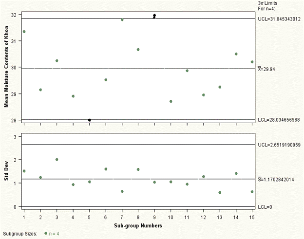
Fig. 27.2 Mean and standard deviation chart for moisture contents of khoa
Range
Chart
![]()
![]()
![]()
The control chart is shown in fig. 27.3
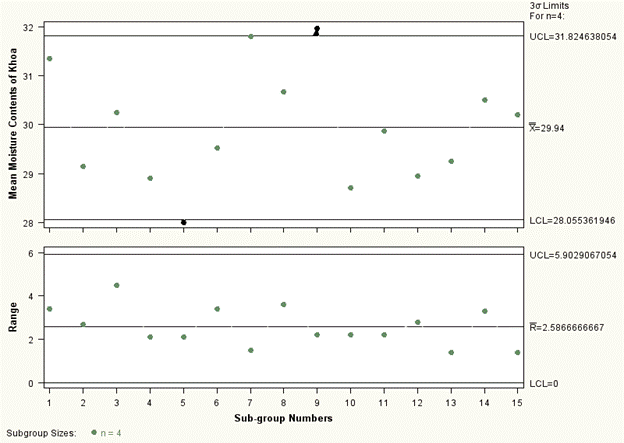
Fig. 27.3 Mean and range chart for moisture contents of khoa
It may be seen from the above control charts for mean and standard deviation as well as mean and range; all the points are within the control limits except 5th and 9th sub-group in mean chart. Therefore, the process is out of control.