Site pages
Current course
Participants
General
Module- 1 Engineering Properties of Biological Mat...
Module- 2 Physical Properties of Biomaterials
Module- 3 Engineering Properties
Module- 4 Rheological Properties of Biomaterials
Module- 5 Food Quality
Module- 6 Food Sampling
Module- 7 Sensory quality
Module 8. Quality Control and Management
Module 9. Food Laws
Module 10. Standards and regulations in food quali...
Lesson 32. Sanitation in food industry
Lesson 26. The 7 Qc Tools For Quality Improvement
26.1 Introduction:
The 7 QC Tools are simple statistical tools used for problem solving. These tools were either developed in Japan or introduced to Japan by the Quality Gurus such as Deming and Juran. These tools have been the foundation of Japan's astonishing industrial resurgence after the second war. In terms of importance, these are the most useful in industries. Kaoru Ishikawa has stated that these 7 tools can be used to solve 95 percent of all problems..
The following are the 7 QC Tools :
1. Check Sheets
2. Histogram
3. Scatter Diagrams
4. Graphs
5. Control Charts
6. Pareto Diagram
7. Cause & Effect Diagram
26.2 Check Sheets
As measurement and collection of data forms the basis for any analysis, this activity needs to be planned in such a way that the information collected is both relevant and comprehensive. Check sheets are tools for collecting data. They are designed specific to the type of data to be collected. Some examples of check sheets are daily maintenance check sheets, attendance records, production log books, etc.
Stratification
Data collected using check sheets needs to be meaningfully classified. Meaningful classification of data is called stratification. Stratification may be by group, location, type, origin, symptom, etc. for Example :
a) Data on rejected product may be classified either machine wise or operator wise or shift wise.
b) Data of production of food grains may be classified nation wise, state wise or district wise, etc.
Fig. 1 Example

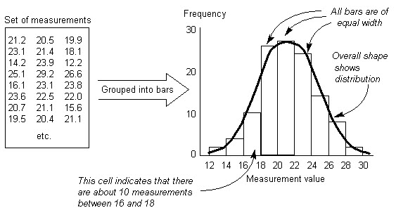
26.3 Histogram
Histograms or Frequency Distribution Diagrams are bar charts showing the distribution pattern of observations grouped in convenient class intervals and arranged in order of magnitude. Histograms are useful in studying patterns of distribution and in drawing conclusions about the process based on the pattern.
The Procedure to prepare a Histogram consists of the following steps :
1. Collect data (preferably 50 or more observations of an item).
2. Arrange all values in an ascending order.
3. Divide the entire range of values into a convenient number of groups each representing an equal class interval. It is customary to have number of groups equal to or less than the square root of the number of observations. However one should not be too rigid about this.
4. Note the number of observations or frequency in each group.
5. Draw X-axis and Y-axis and decide appropriate scales for the groups on X-axis and the number of observations or the frequency on Y-axis.
6. Draw bars representing the frequency for each of the groups.
7. Provide a suitable title to the Histogram.
8. Study the pattern of distribution and draw conclusion.
HISTOGRAM
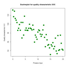
26.4 Scatter diagram
When solving a problem or analysing a situation one needs to know the relationship between two variables. A relationship may or may not exist between two variables. If a relationship exists, it may be positive or negative, it may be strong or weak and may be simple or complex. A tool to study the relationship between two variables is known as Scatter Diagram.
It consists of plotting a series of points representing several observations on a graph in which one variable is on X-axis and the other variable in on Y-axis. The way the points lie scattered in the quadrant gives a good indication of the relationship between the two variables.
Figure shows various types of distributions and relationship between the variables.
|
Scatter Diagram |
Degree of correlation |
Interpretation |
|
|
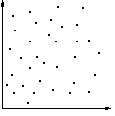
None |
No relationship can be seen. The y variable is not related to the x variable in any way.
|
|
|
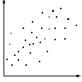
Low |
A vague relationship is seen. There is a low positive correlation between the x variable and the y variable. There might be some connection between the two, but it is not clear.
|
|
|
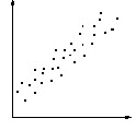
High |
The points are grouped into a clear linear shape. The two variables are clearly related in some way. Given one, you can predict a moderate range in which the other will be found.
|
|
|
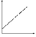
Perfect |
All points lie on a line (which is usually straight). The variables are deterministically related, and given one you can predict the other with accuracy.
|
26.5 Graphs
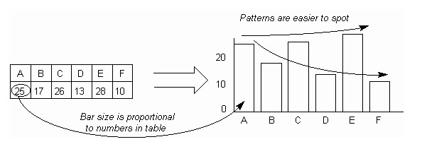
Graphs of various types are used for pictoral representation of data. Pictoral representation enables the user or viewer to quickly grasp the meaning of the data. Different graphical representation of data are chosen depending on the purpose of the analysis and preference of the audience. The different types of graphs used are as given below :
1. Bar Graph To compare sizes of data
2. Line Graph To represent changes of data
3. Gantt Chart To plan and schedule
4. Radar Chart To represent changes in data (before and after)
5. Band Graph Same as above
6. Pie Chart Used to indicate comparative weights
Example: Bar chart
26.6 Control Charts
Control charts was developed by Dr. Walter A. Shewhart during 1920's while he was with Bell Telephone Laboratories.
Control chart makes possible the diagnosis and correction of many production troubles and brings substantial improvements in the quality of the products and reduction of spoilage and rework. It tells us when to leave a process alone as well as when to take action to correct trouble.

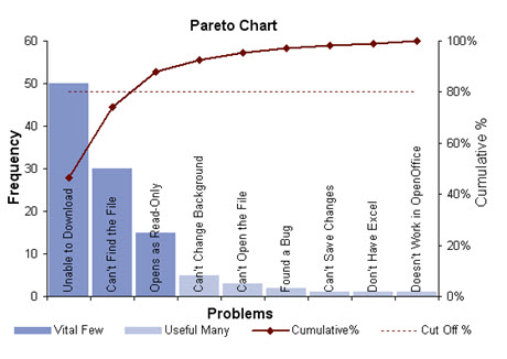
26.7 Pareto Diagram
Pareto Diagram is a tool that arranges items in the order of the magnitude of their contribution, thereby identifying a few items exerting maximum influence. The origin of the tool lies in the observation by an Italian economist Vilfredo Pareto that a large portion of wealth was in the hands of a few people. He observed that such distribution pattern was common in most fields. Pareto principle also known as the 80/20 rule is used in the field of materials management etc
Procedure : The steps in the preparation of a Pareto Diagram are :
1. From the available data calculate the contribution of each individual item.
2. Arrange the items in descending order of their individual contributions. If there are too many items contributing a small percentage of the contribution, group them together as "others". It is obvious that "others" will contribute more than a few single individual items. Still it is kept last in the new order of items.
3. Tabulate the items, their contributions in absolute number as well as in percent of total and cumulative contribution of the items.
4. Draw X and Y axes. Various items are represented on the X-axis. Unlike other graphs Pareto Diagrams have two Y-axes - one on the left representing numbers and the one on right representing the percent contributions. The scale for X-axis is selected in such a manner that all the items including others are accommodated between the two Y axes. The scales for the Y-axes are so selected that the total number of items on the left side and 100% on the right side occupy the same height.
5. Draw bars representing the contributions of each item.
6. Plot points for cumulative contributions at the end of each item. A simple way to do this is to draw the bars for the second and each subsequent item at their normal place on the X-axis as well as at a level where the previous bar ends. This bar at the higher level is drawn in dotted lines. Drawing the second bar is not normally recommended in the texts.
7. Connect the points. If additional bars as suggested in step 6 are drawn this becomes simple. All one needs to do is - connect the diagonals of the bars to the origin.
8. The chart is now ready for interpretation. The slope of the chart suddenly changes at some point. This point separates the 'vital few' from the 'useful many' like the A,B and C class items in materials management.
An example of a Pareto Chart
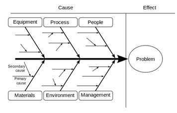
26.8 Cause & Effect Diagram
A Cause-and Effect Diagram is a tool that shows systematic relationship between a result or a symptom or an effect and its possible causes. It is an effective tool to systematically generate ideas about causes for problems and to present these in a structured form. This tool was devised by Dr. Kouro Ishikawa and as mentioned earlier is also known as Ishikawa Diagram.
Structure
Another name for the tool, as we have seen earlier, is Fish-Bone Diagram due to the shape of the completed structure. The symptom or result or effect for which one wants to find causes is put in the dark box on the right. The lighter boxes at the end of the large bones are main groups in which the ideas are classified. Usually four to six such groups are identified. In a typical manufacturing problem, the groups may consist of five Ms - Men, Machines, Materials, Method and Measurement. The six M Money may be added if it is relevant. Important subgroups in each of these main groups are represented on the middle bones and these branch off further into subsidiary causes represented as small bones. The arrows indicate the direction of the path from the cause to the effect.
Procedure
The steps in the procedure to prepare a cause-and-effect diagram are :
1. Agree on the definition of the 'Effect' for which causes are to be found. Place the effect in the dark box at the right. Draw the spine or the backbone as a dark line leading to the box for the effect.
2. Determine the main groups or categories of causes. Place them in boxes and connect them through large bones to the backbone.
3. Brainstorm to find possible causes and subsidiary causes under each of the main groups. Make sure that the route from the cause to the effect is correctly depicted. The path must start from a root cause and end in the effect.
4. After completing all the main groups, brainstorm for more causes that may have escaped earlier.
5. Once the diagram is complete, discuss relative importance of the causes. Short list the important root causes.
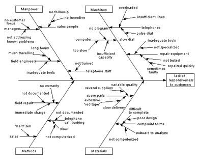
An example of a cause and effect diagram
 |
 |
Last modified: Saturday, 31 August 2013, 9:35 AM